Road to Vector 2.0
A write-up of what we did to get here: design language, tooling, and the decisions that shape how we build. No fluff, just the approach, the obstacles, and how we got past them.

Reading Mode
Font Size
Line Spacing
We’ve spent the last few months with our heads down, keyboards rattling, building high-performance systems for everyone else. Meanwhile, our own digital storefront, the Vector website, had become a bit of a museum. It was technically sound, but it was a patchwork of four generations of ideas, two different UI frameworks, and three separate build/deployment processes.
The technical debt wasn’t just high; it was a tower of “we’ll fix that later.”
With the release of our new in-house tooling (beads (bd), bdui, and the launch of our own CRM/Billing system, Orion), we decided it was time to point the cannon at ourselves. This wasn’t just a redesign; it was an implementation of the guerilla development ethos we live by. We also introduced a new visual identity: the Vector Costa Rica 2026 logo, which now anchors the navbar, footer, and key touchpoints. It’s a clean mark that fits the direction we’re heading: clear, recognizable, and built to last.
The Nerd Factor: Why We Do This
I like to be transparent about this process because it tells our story better than any marketing blurb could. Underneath all the LinkedIn posts and “tech mumbo jumbo,” me (Lorenzo) and my business partner are just two nerds who actually enjoy the craft.
I tend to sink at least 12 hours a day into these projects, pushing things forward. We aren’t interested in squeezing money out of people or adding feature bulk for clout. We want to deliver technology that feels tangible and support that actually exists when you need it. Vector was always meant to be a stepping stone, a way to take an idea and implement it end-to-end: from defining stacks and colors to architecture, CI/CD, and long-term retroactive support.
This update is us finally aligning our own site with that design ethos.
The Technical Deep-Dive
We wanted the site to feel coherent and predictable. That required naming our problems and fixing them at the root.
1. The Death of Hover Noise
Early on, we fell into the “more hover = more polish” trap. We had hover animations on cards, badges, and decorative pills. It looked lively in a demo, but it was a UX nightmare. Users couldn’t tell what was an actual link and what was just a “pretty” box reacting to their cursor.
The Rule: Hover only on interactive elements (buttons, links, toggles, nav, footer links).
The Execution: We stripped hover from stat cards, timeline items, carousel containers, blog cards, and non-interactive UI like skill badges and CTA wrappers. If it doesn’t do something, it doesn’t move.
The Result: A UI that feels stable, professional, and intentional. Clickable things respond; everything else stays put.
2. Solving “Hover Jank”
We noticed an annoying flicker when a cursor hit the edge of a button. We were using scale on hover. The button would grow, the boundary would move past the cursor, the hover would “end,” the button would shrink, and the cycle would loop infinitely.
The Fix: We ditched scale for interactive elements and switched to opacity transitions (e.g. icons at 80% opacity, 100% on hover). Opacity doesn’t change the “box” of the element, so the flicker is dead. We saved the scale effects for non-interactive eye candy (like blog card images) where the user isn’t trying to click anything.
3. The Icon Cascade War
We were fighting a constant battle with CSS to keep icons consistent across light and dark modes. On hover, icons would sometimes flip to the wrong color, or we’d have to manually pair light/dark versions in every single template.
The Fix: We built a standardized ButtonIcon component. It uses currentColor, so the icon automatically inherits the color of the button text. No more global theme overrides or light/dark pairs. One component, one place to change things. We migrated every button and link (floating contact, hero CTAs, modals, carousels) to use it. Icons now behave the same everywhere and respect dark mode without extra logic.
5. Hero Section and Three.js Canvas
The hero had accumulated multiple HUDs (status, location, coordinates) and a “Based in Costa Rica” badge on the card. The background didn’t always match dark mode, and the Three.js canvas could flash or get out of sync after a theme toggle.
What we did: We made the hero always dark (same slate in light mode, matches site background in dark mode). We cut the HUD down to a single block: Costa Rica flag plus “Made with ♥ in Costa Rica” (fully localized). We removed the extra badge from the card and moved the scroll pill higher and slightly wider. For the Three.js canvas we switched to a dark clear color so there’s no light flash on load. We increased wave and turbulence, added a green color flow, turned on antialias and higher grid resolution, and deferred init by one frame so the canvas restarts cleanly after a theme change. Gradient wrappers now listen for our theme-applied event and only update when dark state actually changes, so the hero and the rest of the site stay in sync on every locale, including Spanish.
Why it matters: One clear hero, no visual noise, and a canvas that behaves the same in both themes and across client-side navigation.
6. The Project Carousel
We wanted the approach section to showcase our work without sending people on a scavenger hunt. The projects page already had a modal that opens for a given project; we needed a way to surface that on the homepage.
What we did: We added a horizontal project carousel in the approach section. It pulls from the same project data we use everywhere. Each card links to /{lang}/projects#project-{key} so when you click “View project” you land on the projects page with the right modal already open. We gave it prev/next buttons with our standard arrow icon, a styled scrollbar, and auto-scroll (5-second interval) that pauses on hover and when the carousel is out of view. Desktop gets extra bottom margin so the section breathes. The carousel uses the same design language as the rest of the site: no hover on the cards themselves, only on the buttons and links inside.
Why it matters: Visitors see our work in context without leaving the homepage, and the link-to-modal flow works in both languages.
7. Living Documentation
We moved away from loose markdown files scattered in the root folder. Everything now lives in a dedicated /documentation directory:
- Design.md: Every rule about borders (1px), rounding (
rounded-md), buttons, icons, and hover is recorded here. When we hit a recurring issue (like hover jank), we wrote it down so we don’t repeat the same mistake. - Changelog.md: Version history and release notes. The source of truth for what shipped and when.
- About.md: Feature and system overview; links to the rest of the docs.
- Marketing.md: Voice, ethos, and SEO notes so copy stays aligned with how we want to sound.
- Release.md: How we bump versions, update the changelog, and tag releases.
- Debt.md: We’re honest about what’s still broken and who owns it.
- Dated audits: We keep timestamped UX and performance audits in
/documentation/dated/to track our progress over time.
The root stays minimal: README (what the project is, how to run it, links to docs) and our workflow file. One place to look, same structure across our projects.
8. Projects Page Alignment
The projects page (portfolio grid, focus modal, search, and filters) was brought in line with the same standards we applied site-wide.
What we did: Every interactive control now follows the design system. The “View project” button on each card has an arrow icon (ButtonIcon) and uses the same hover behavior as ButtonMain (translate-y-1, shadow drop). The modal close button uses ButtonIcon (close) and a clear border so it reads as a control. The “Visit Live Site” link in the modal is a proper CTA: 1px border (not 2px), arrow icon, and the same press-down hover. Search and sort use rounded-md and design-token borders; filter pills use border-accent/30 and a scoped active state (accent border and tint) so the selected filter is obvious without custom one-off styles. Card image areas use rounded-t-lg instead of a heavier radius so cards stay consistent with the rest of the site.
Why it matters: The projects page is where we send people from the homepage carousel. It now matches the same language as the rest of the site: one border and rounding system, icons on every button and link, and no scale-based hover on interactive elements.
Hero and section tie-in: The projects hero was aligned with the same standards as the home hero. The section uses an always-dark background (bg-[#0f172a] / dark:bg-background), a single HUD block top-left (Costa Rica + “Made with ♥ in Costa Rica”), and a 1px border on the content panel (border-l border-white/10 instead of a thick primary border). The scroll pill uses rounded-md, border border-white/10, and opacity-only feedback on the arrow (no scale) to avoid hover jank. The projects section below has an explicit bg-background and a subtle radial gradient overlay so the whole page feels like one flow from hero into grid. The focus-view modal panel uses rounded-md and border-accent/20 so it matches the rest of the design system.
9. FAQ expansion and tech clarity
We rewrote the FAQ so it reflects what we actually do and how we work. Every answer was expanded using the same voice and facts as the rest of the site (About, Development, services, hero). We called out core technologies explicitly: Astro, React, Tailwind, Laravel, Docker, Coolify, PostgreSQL, WordPress, Shopify, and how we use them. We added a dedicated “What technologies and tools do you use?” entry and fixed the hosting answer so it no longer referenced undefined plan tiers—instead we describe how we choose hosting (traffic, app type, budget) and that we deploy with Docker and Coolify. The FAQ hero and section layout were aligned with the inner-page pattern (centered card, gradient, blueprint grid, scroll pill), and the accordion uses the same design tokens and card style as the rest of the site. EN and ES are fully in sync.
Where We Stand (Loose Ends and All)
Is the site perfect? No. We still have loose ends. There are inconsistencies we haven’t reached yet, and the Debt.md file still has a few entries that keep us up at night. But that’s the point. This post isn’t a “mission accomplished” banner; it’s a progress report.
We’ve established the bedrock:
- New logo and visual identity: The Vector Costa Rica 2026 logo is live across the site. It switches correctly in dark mode and on every locale (including Spanish). One mark, one standard.
- Hero and Three.js: Always-dark hero, single HUD (“Made with ♥ in Costa Rica”), no flash. Canvas stays in sync with theme and language across all locales.
- Project carousel: Horizontal scroll of project cards on the homepage approach section; “View project” links open the correct modal on the projects page via URL hash. Auto-scroll, styled scrollbar, same design language.
- Projects page: Grid, modal, search, and filters aligned with design standards. ButtonIcon on View and Close and Live link; rounded-md and 1px borders; filter pills use accent tokens and scoped active state.
- Why Us cards: Six cards with icons and full i18n in the approach section so the value proposition is clear in both languages.
- Dark mode and theme sync: Class-based Tailwind dark variant; navbar logo toggles correctly on every locale. Theme and language stay in sync after client-side navigation.
- Orion integration: Our CRM/Billing is live, paving the way for a new client experience.
- Tailwind 4+: We’ve fully embraced the CSS-first approach. No config file sprawl; design tokens and rules live where we can find them.
- Workflow rigor: We follow a strict branch model (feature → dev → production) with tagged releases and automated deployments via Coolify. No direct commits to production; code and task tracking stay in sync.
- FAQ: Content heavily expanded (EN/ES) and aligned with site positioning and core tech. New “What technologies do you use?” entry; hosting answer clarified; hero and section use the same design language as other inner pages.
We fixed what was broken, wrote down our decisions, and made our tooling support the way we actually work. That’s the approach we use for our clients, and it’s finally the approach we’re using for ourselves.
Thanks for sticking with us. We’re just getting started.
Related Articles
Matta Ruiz: a digital presence as solid as the work
How we gave a 20-year Nicoya Peninsula builder a fast, bilingual website that matches their reputation, and quietly made it ready for the AI assistants now searching on customers' behalf.
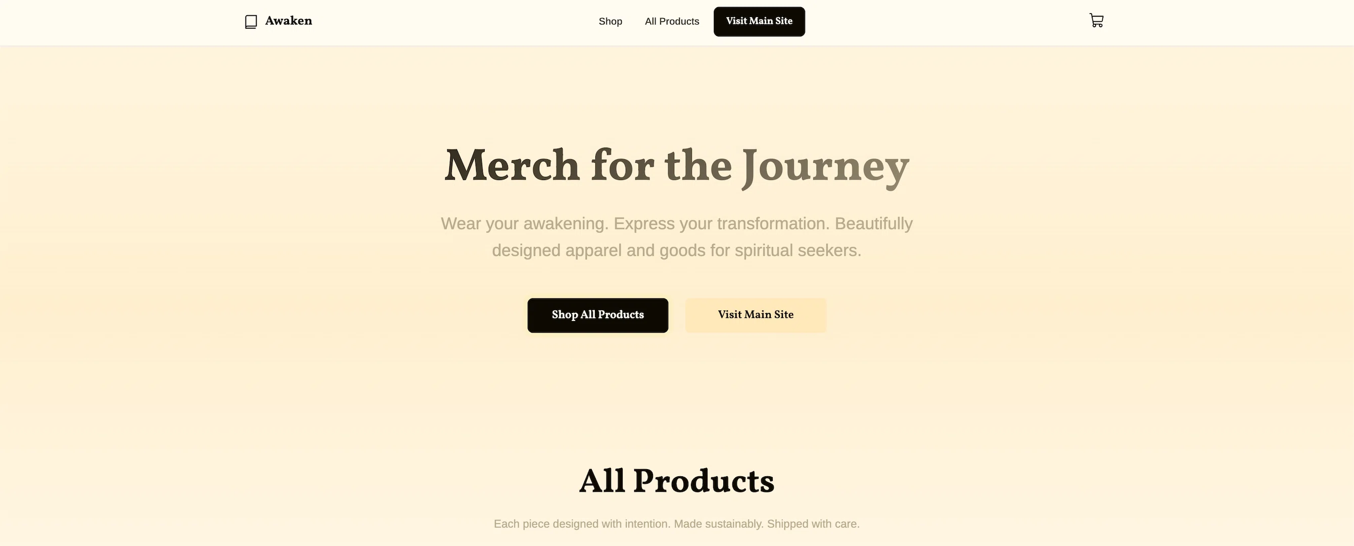
Learning Shopify: 8 Hours of Liquid Templates and E-commerce Development
My journey learning Shopify development by building a custom theme from scratch instead of using embedded widgets, and what I discovered about handling complex Printful variants, bilingual content, and brand consistency.
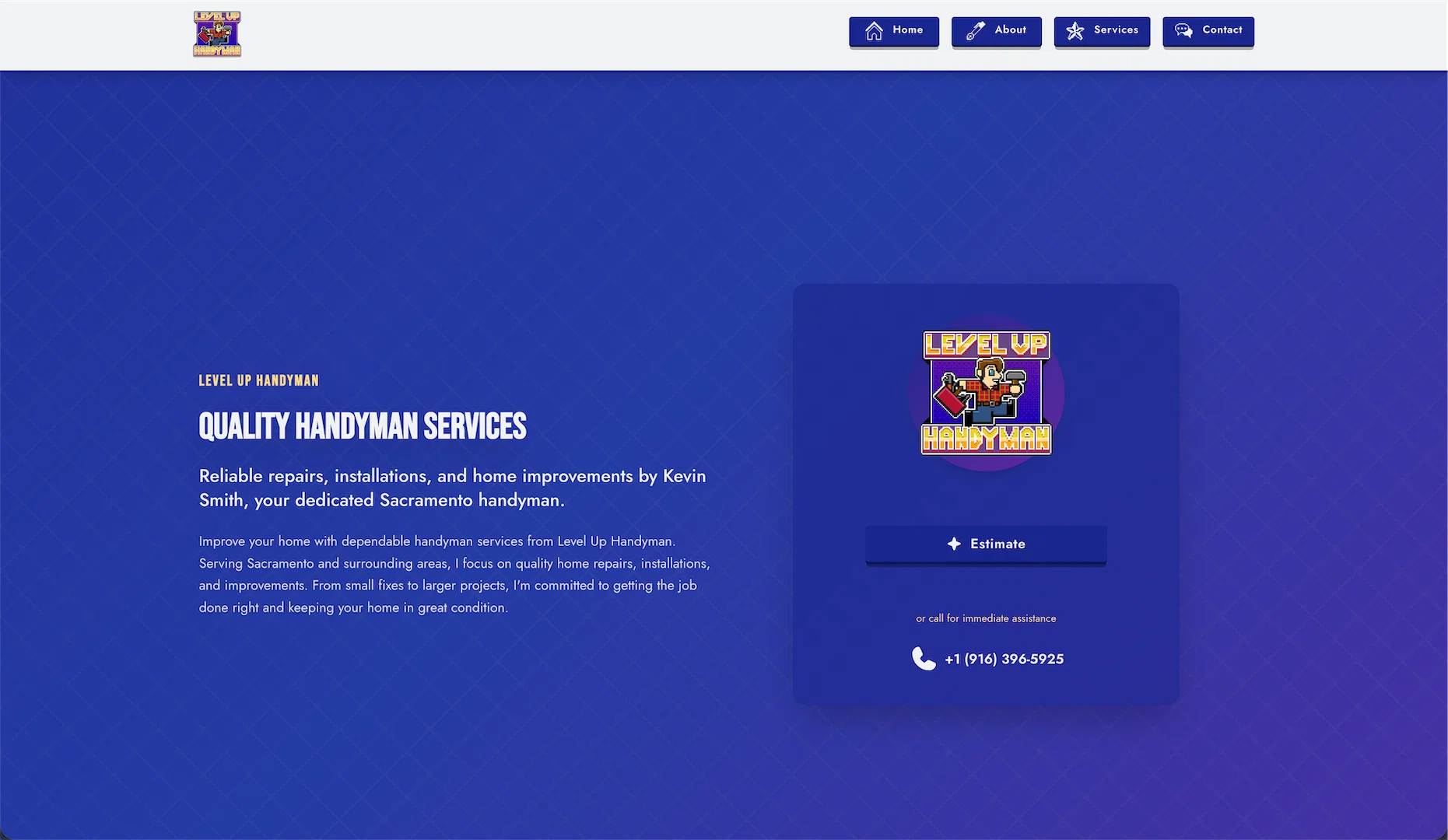
Building a Handyman Site That Doesn't Look Like Every Other Handyman Site
A straightforward look at building LvlUp Handyman's website—distinct visual identity, interactive service search, and why intentional design choices help businesses stand out in crowded markets.
Liked this?
Let's build yours
This is how we think about every build. Tell us about yours: a free consultation, a real human, no pressure.